Mayer (2017) referred to multimedia instruction as facilitating learning through the use of pictures and words in an intentional and purposeful manner. Words can been expressed verbally, such as narration, or in a written format, such as online text. Pictures can be presented in a static format, such as images, or dynamically, such as animations or videos. The underlying rationale of the multimedia principle is that students learn most affectively when words are used alongside pictures rather than words alone (Mayer 2009). In considering multimedia instruction Mayer created (2017) twelve principles as guidelines to create meaningful learning. Traditionally spoken language has been most validated form of instruction; however, these principles display the value of incorporating visuals in a meaningful manner. The e-learning principles are as follows:
- multimedia principle – use words and pictures in combination
- coherence principle – exclude extraneous material
- signalling principle – highlight essential parts of text or graphics
- redundancy principle – use narration and graphics opposed to graphics, narration and on-screen text
- spatial contiguity principle – printed words adjacent to graphics
- temporal continuity principle – simultaneously narrate with corresponding graphic
- segmenting principle – chuck information into segments
- pre-training principle – pre-teach key elements
- modality principle – use spoken words over printed
- personalization principle – use conversational language rather than formalized
- voice principle – spoken in a human voice rather than a machine-like voice
- embodiment principle – use high-embodied on-screen agents opposed to low-embodied
With the consideration of these principles, I began reflecting upon my own practice. With my students we use a number of apps quite frequently, including Seesaw and RazKids.
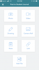
The Seesaw app aligns with some of Mayer’s (2017) principles. When students seek to post on their e-portfolios they have to first chose the media format in which they would like to display their learning. The screen is set up with various options all of which are listed with text and a corresponding graphic (multimedia principle). Additionally, following the spatial contiguity principle, the text is written directly below each graphic.

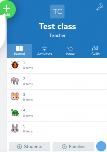
On the other hand, the app uses animal graphics to correlate between individual student profiles. The cartoon animal graphics appear to be extraneous material as they do not relate to the students themselves nor do they relate to portfolios. With the intent of these graphics being to assist young learners in recognizing their accounts, would it be more meaningful for the app to allow student photos instead?

RazKids is an app I use to support literacy in my classroom. Again RazKids uses irrelevant icons (shapes and colours) to represent student profiles. Then once students login the apps display is focused on a space theme which is irrelevant to the students literacy and appears to be adding extraneous material.

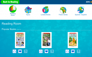
The icons in the “Reading Room” follow the multimedia principle and spatial contiguity principle, similarly to the Seesaw app. The graphics are related to the text that is listed below to allow young learners to easily access the available options.

Reflecting on these two apps are just the beginning of the ways in which these principles can begin to inform my teaching. With these principles in mind, it is time to start critically addressing all my teaching materials and how they can best support my students learning.
Bye for now!
Mrs. P
Mayer, R. E. (2017). Using multimedia for e‐learning. Journal of Computer Assisted Learning, 33(5), 403-423. doi:10.1111/jcal.12197. Retrieved from: http://tinyurl.com/y3mr2lus
Mayer, R. E. (2009).Multimedia learning(2nd ed.). New York:Cambridge University Press.
Hi Trisha,
I appreciate your connection of the 12 principles of multimedia literacies to your own practice. I have also used RazKids and Seesaw in the past but had not regarded them with a critical eye. I wondered if you noticed how the TPACK video used the 12 principles to create an optimal learning experience for viewers.
Ashley